Strength, with a little gold.
ESTR is a social wellness club in Panama City: training, recovery, and community under one roof. Its vision is to redefine wellness here, with a place where every member feels connected, empowered, and capable of lasting change. We built the identity to match: a modern crest, a confident serif wordmark, and a palette of deep black and signature gold.
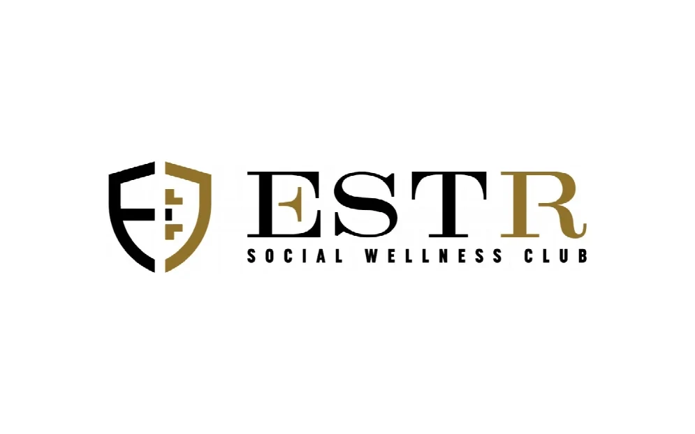
The house shield
The mark is a modern crest, the club’s “house shield” for a private, members-first space. The letter E forms its left side and a stylized barbell forms the right, so the identity starts from the strength at the core of the club.
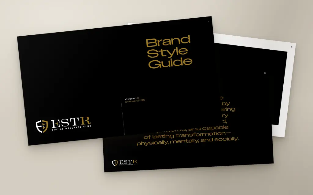
The brand style guide
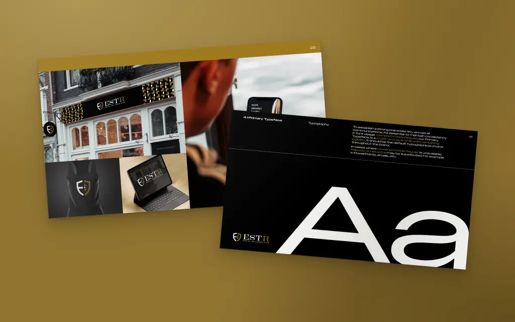
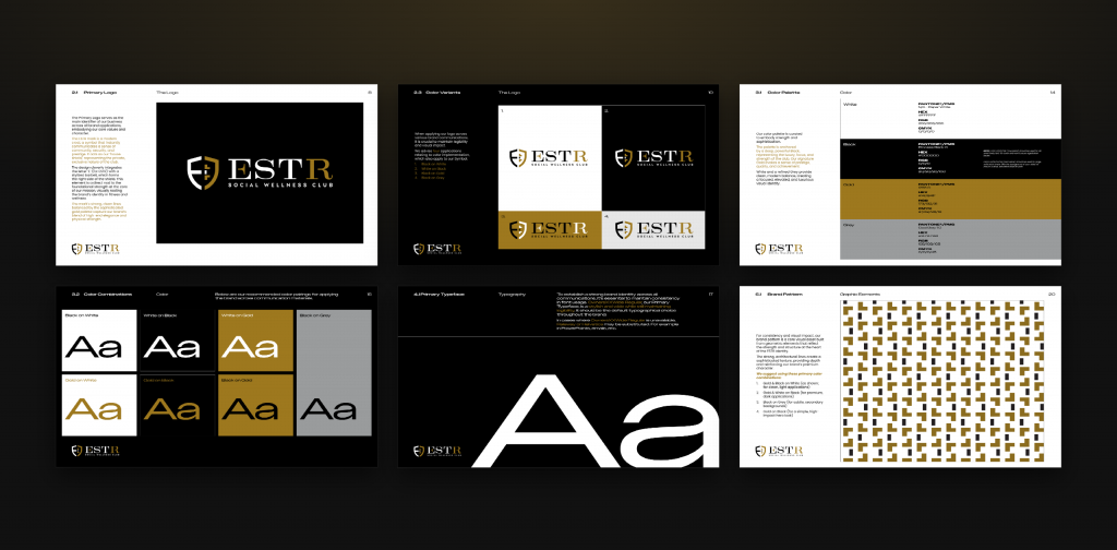
A full brand style guide, 23 pages from vision and mission to logo rules, color, typography, a geometric brand pattern, and in-situ examples, so every sign, post, and screen looks like ESTR.
The website
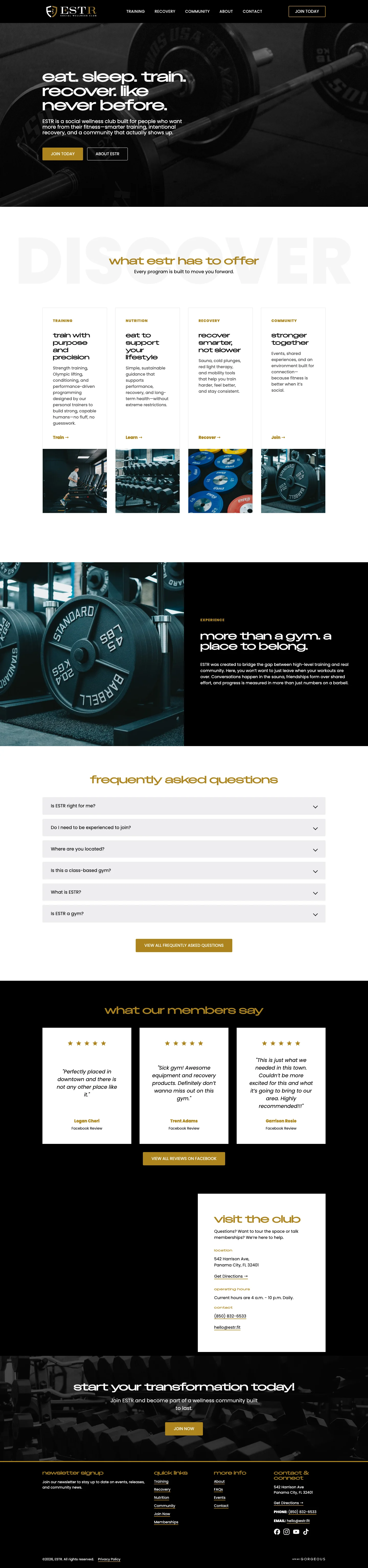
We designed and built estr.fit on the same system: training, nutrition, recovery, and community up front, real member reviews, everything you need to visit, and a clear path to join.
Out in the world
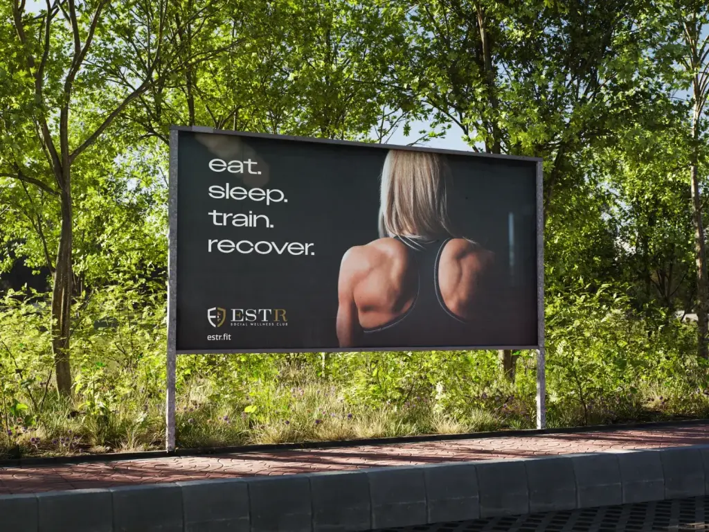
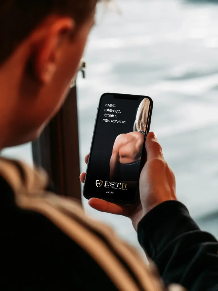
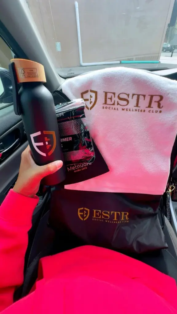
One line, eat. sleep. train. recover., carries the brand from the roadside to the phone in your hand, and the crest goes home with members on the gear they use every day.